Avanture
Duration
May to Jun 2022
Role
Research, design and test
Location
Hong Kong
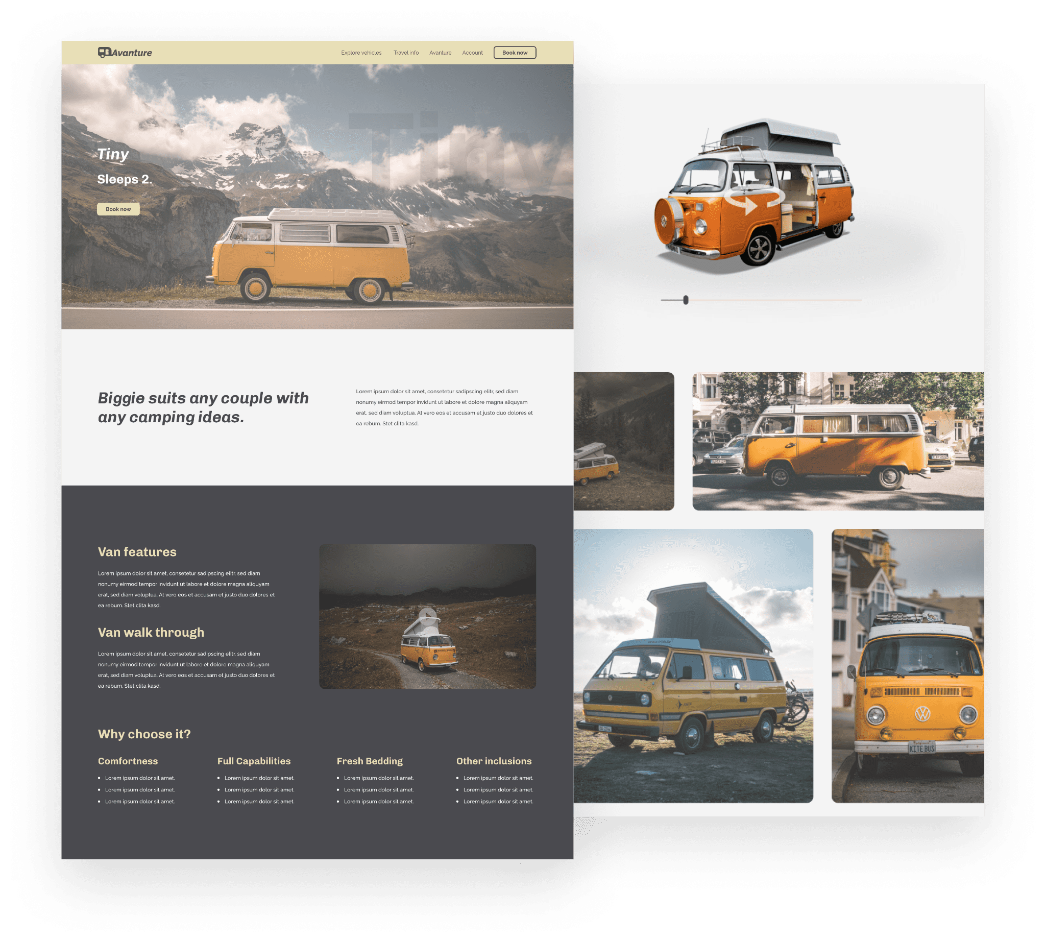
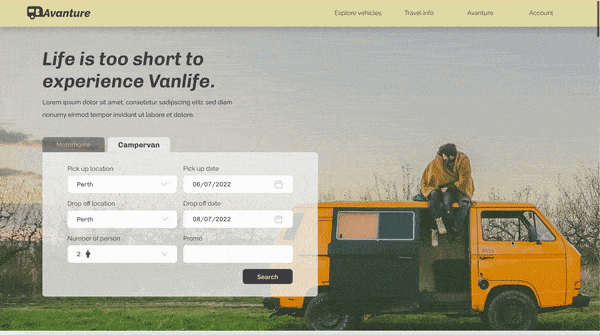
Avanture is a car rental company specializing in road trips, offering various vans for rent and providing travelers with useful trip information for easy van selection.
Duration
May to Jun 2022
Role
Research, design and test
Location
Hong Kong
What I used
- Adobe XD
- Adobe Photoshop
- Adobe Illustrator
What I did
- Conducting interviews and usability tests
- Paper and digital wireframing
- Low and high-fidelity prototyping
- Conducting usability studies
- Accounting for accessibility
- Iterating on designs
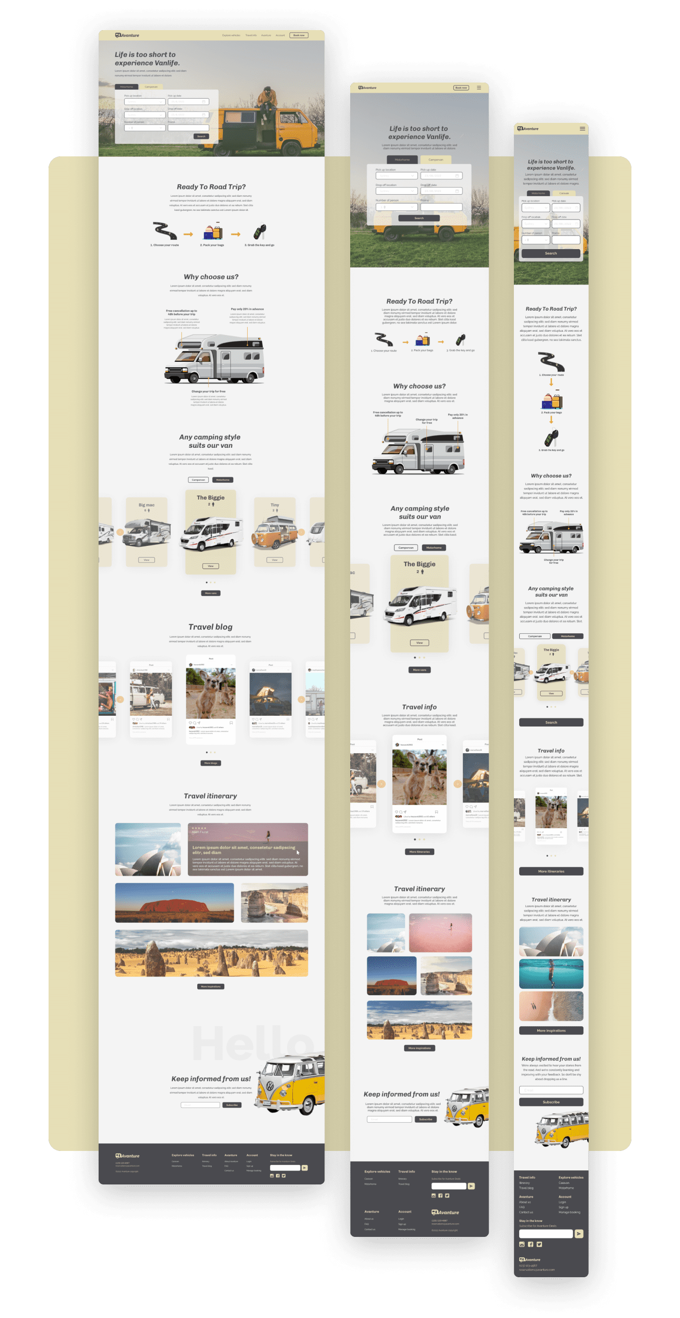
- Responsive design
Project background
Type: 2nd project from Google UX design course
Duration: 1 month
Client: Road trip traveller
Time: June 2021
Mockup Link
User's Pain Points
User interviews revealed that road trip travelers struggle to choose a suitable van due to lack of knowledge and find the vast number of options overwhelming.
Hi, I'm Chris! I love taking long holidays to explore new places but struggle to choose the right camper van due to my lack of experience with long drives and van living.

Solutions
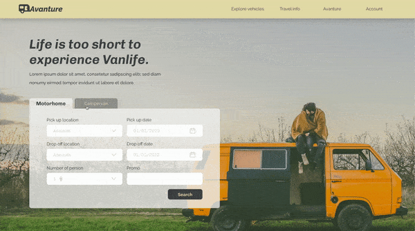
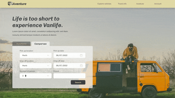
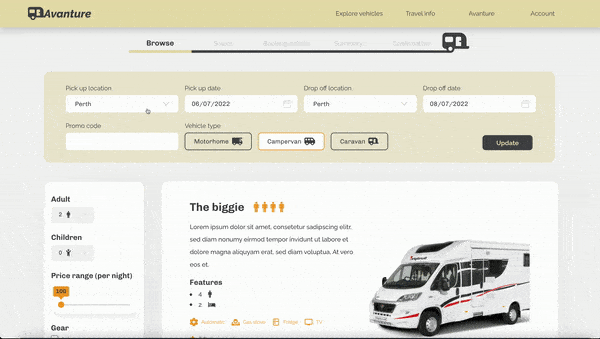
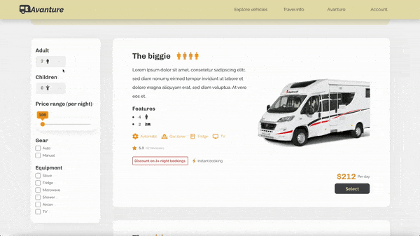
To address travelers' overwhelm in selecting a camper van, I propose a redesign with an intuitive search filter and a streamlined ordering process to enhance the browsing and selection experience.
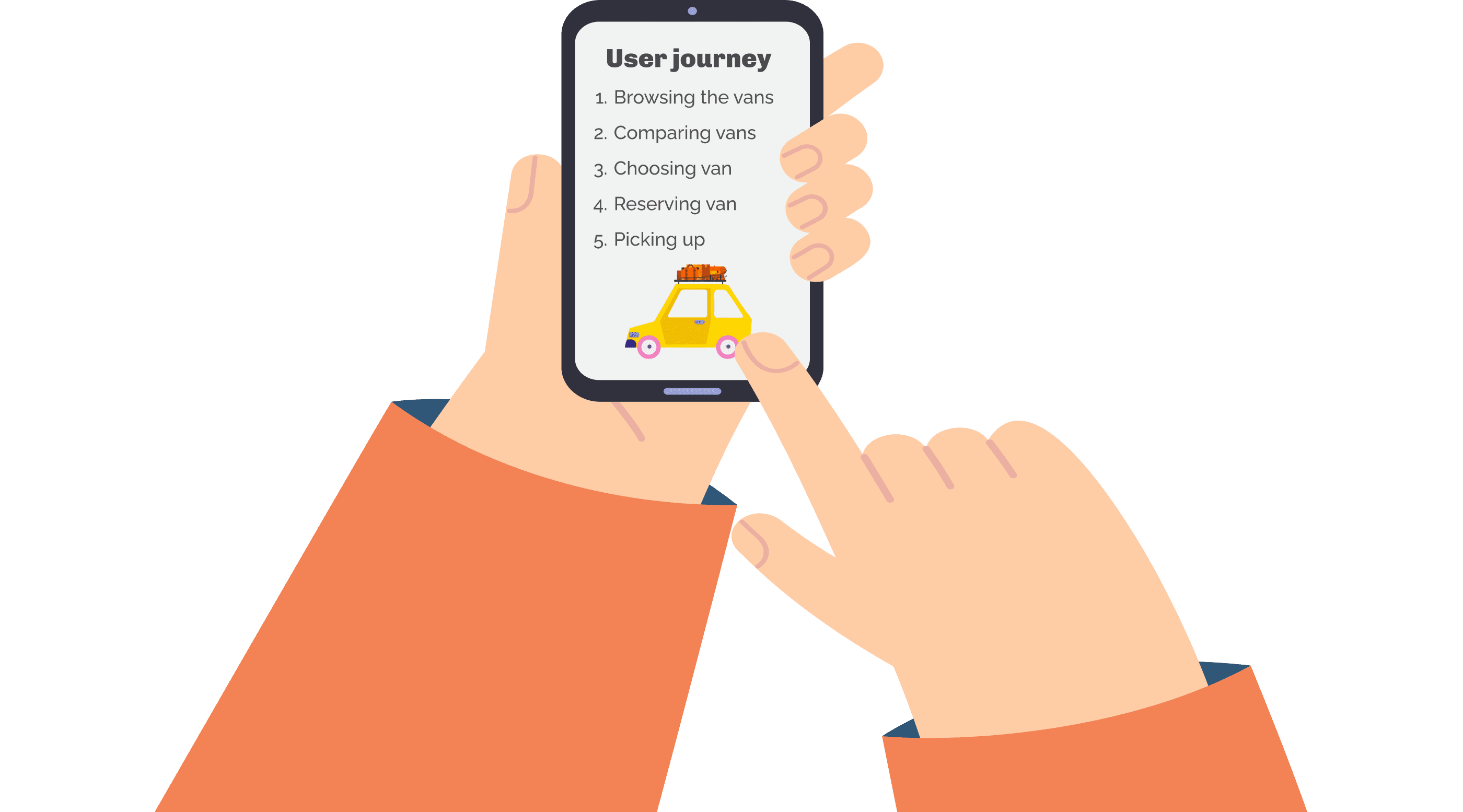
User Journey
I use the user journey to analyze how users interact with a product, identifying pain points and opportunities for improvement. This approach ensures the final product meets user needs and expectations.
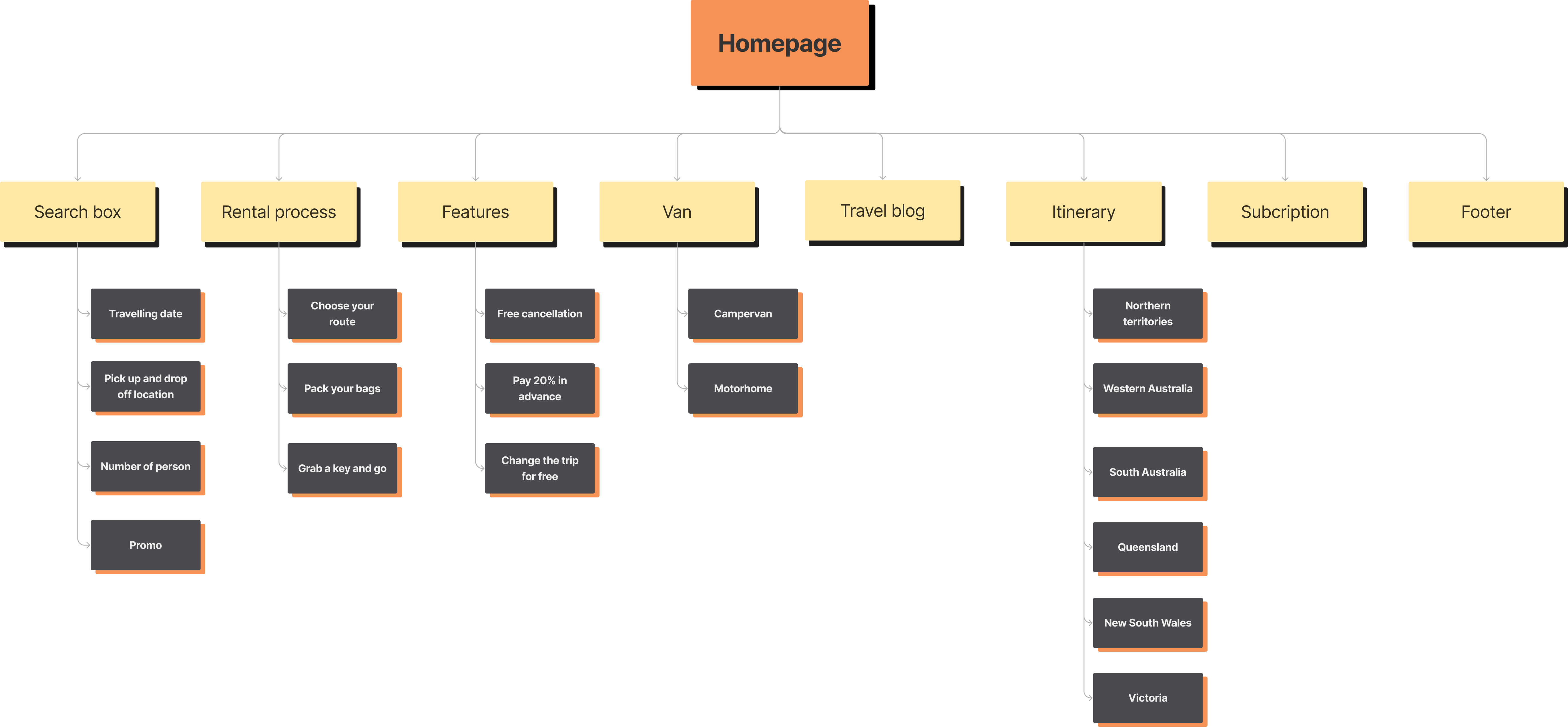
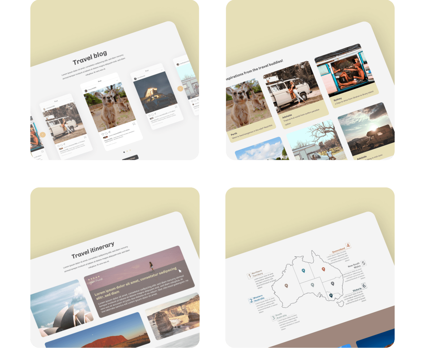
Sitemap
Developing the sitemap allowed me to establish the layout and organization of the website, ultimately enhancing the user's browsing experience through improved navigation.
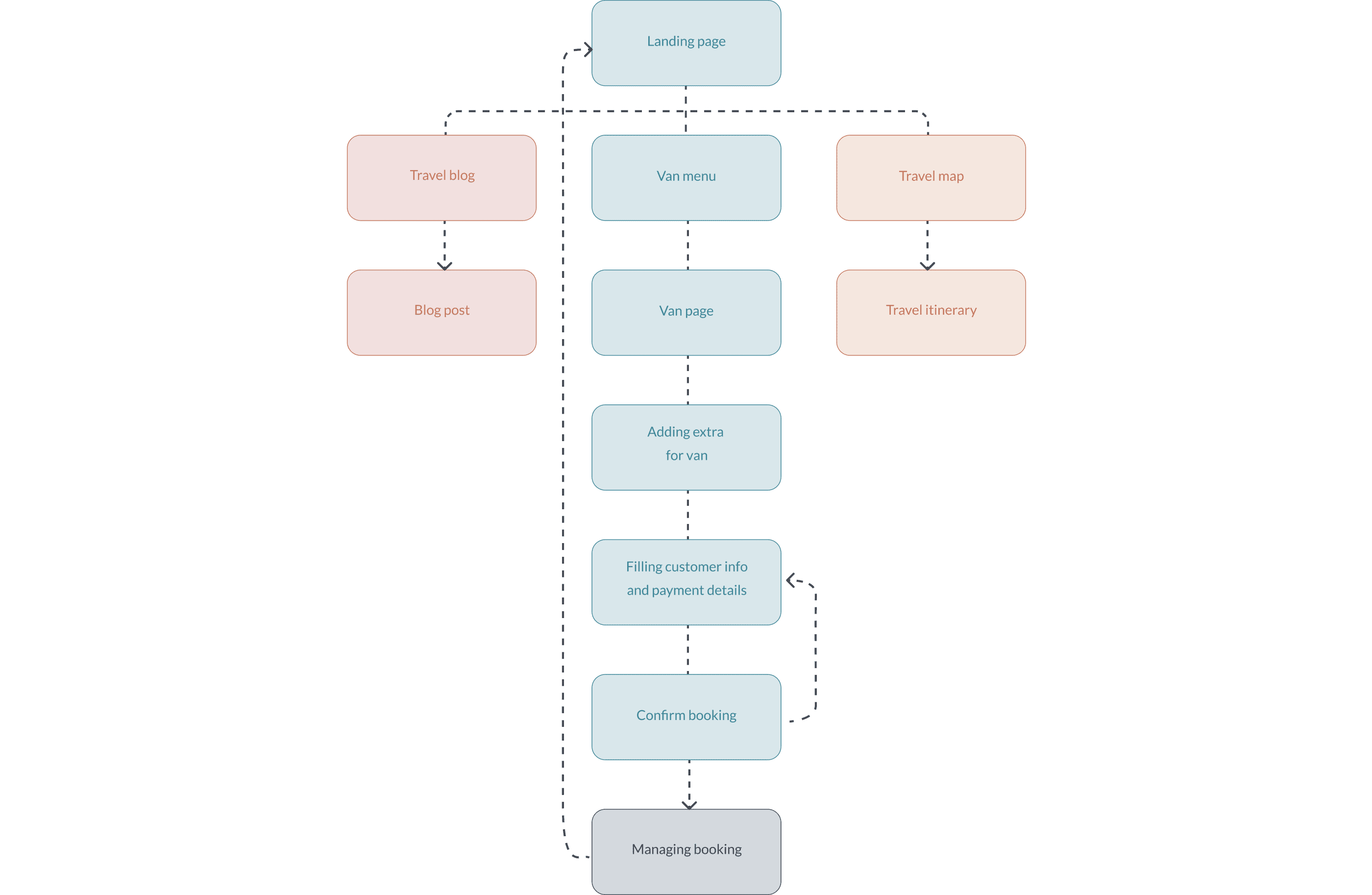
Userflow
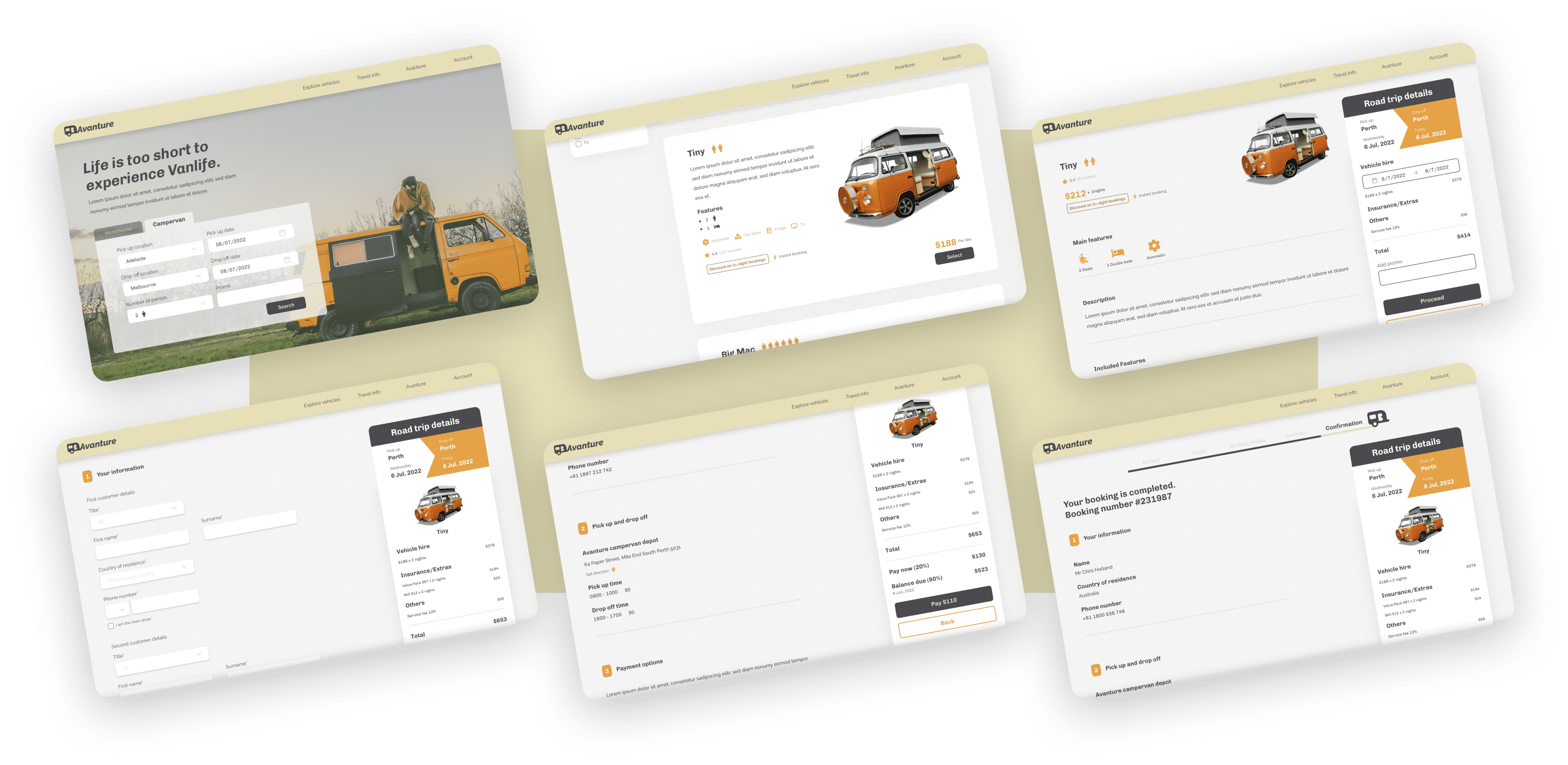
I developed a user flow to simplify the van booking process, focusing on improving van search and filtering, customer information input, payment processing, and booking confirmation.
Crazy Eight
To generate ideas before beginning the design process, I utilized a brainstorming technique called Crazy Eight. I folded a piece of paper into eight grids and drew eight ideas within eight minutes.
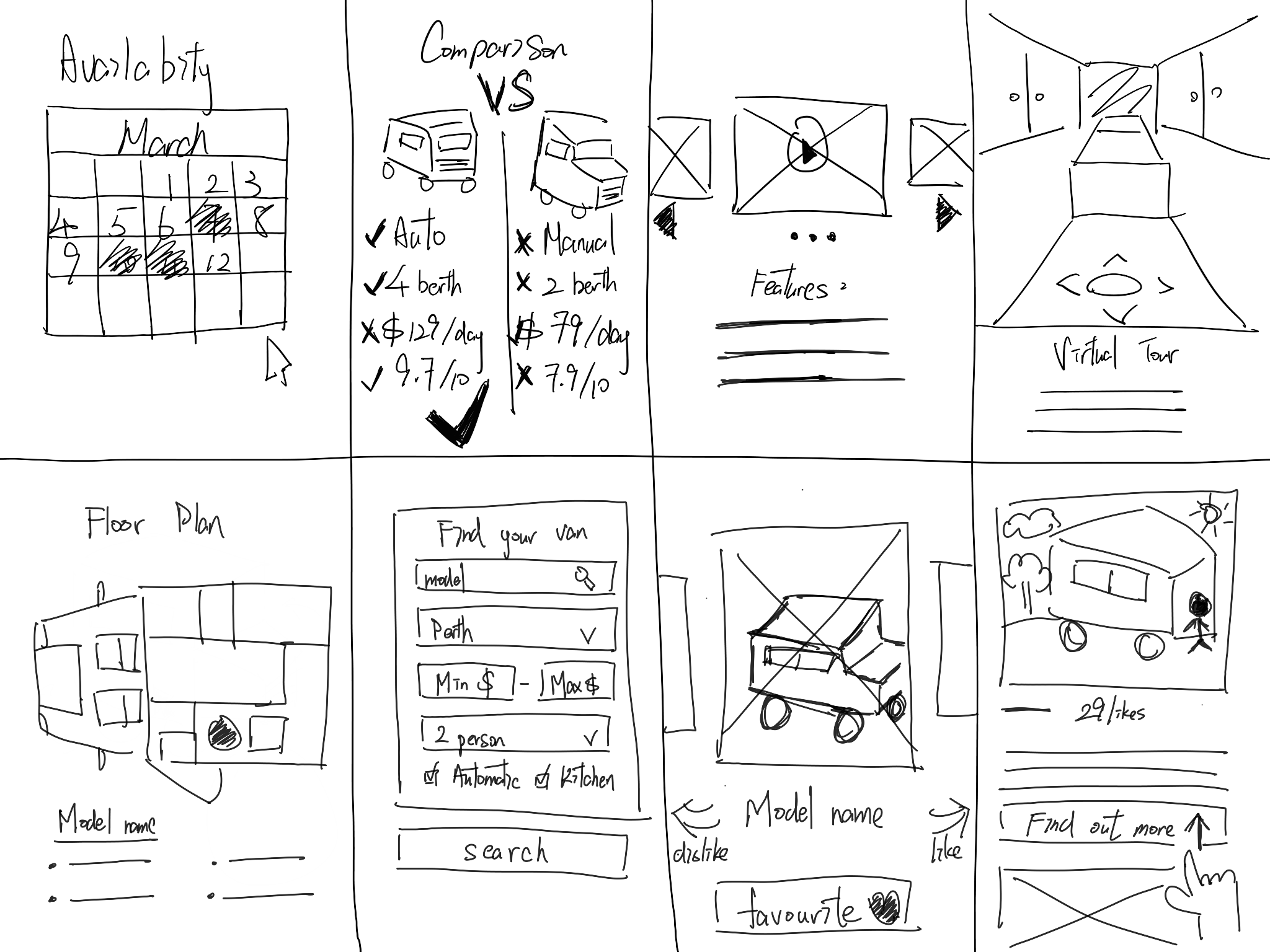
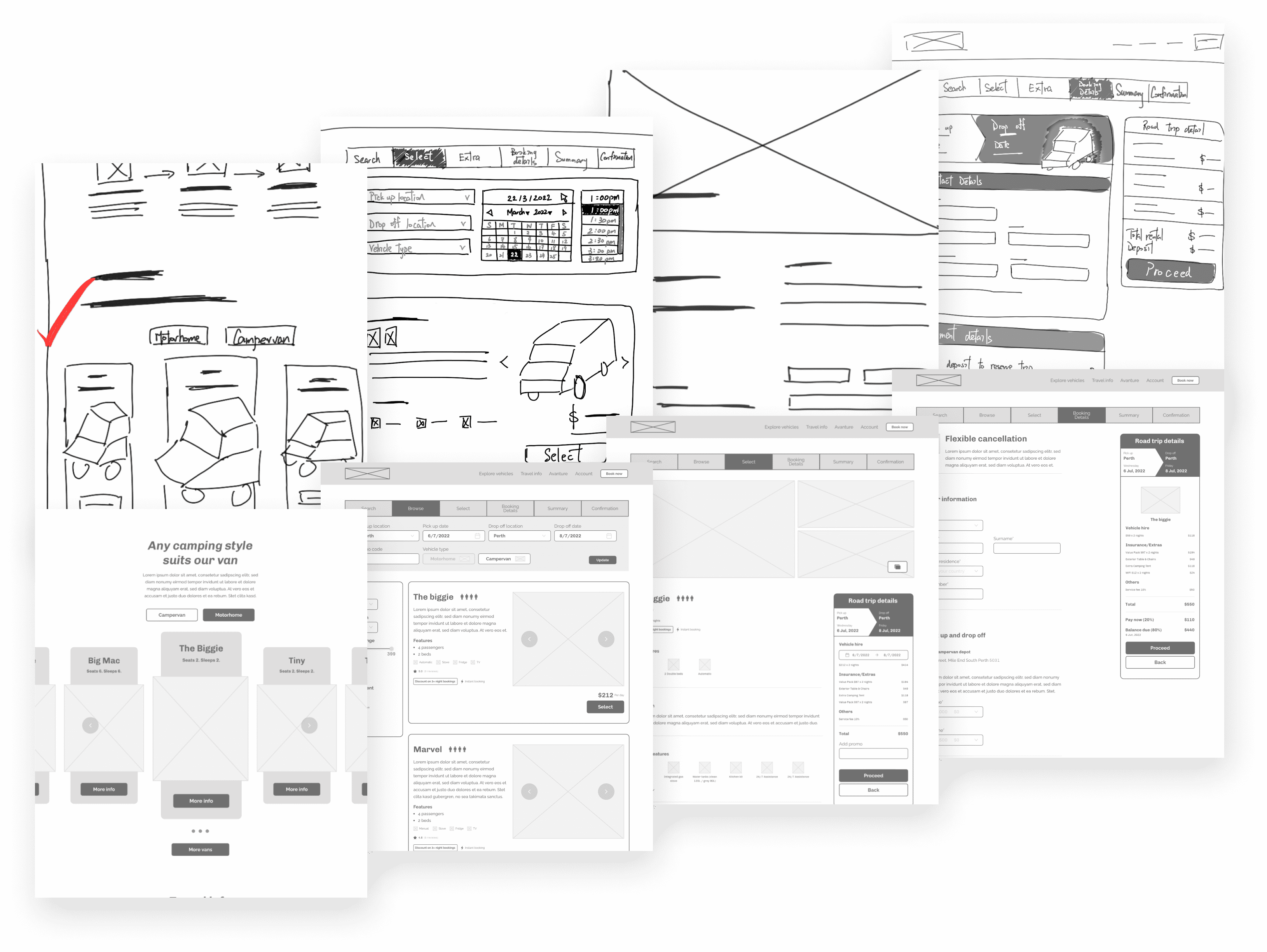
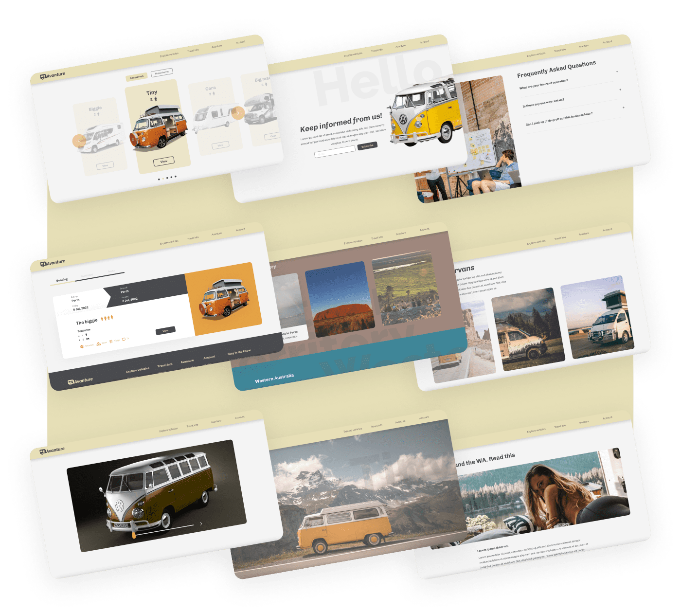
Paper and Low Fidelity Wireframe
I used the user flow to sketch paper wireframes for Avanture, addressing navigation, browsing, and checkout pain points. I then created a low-fidelity prototype to test usability, focusing on button placement and a streamlined booking process.
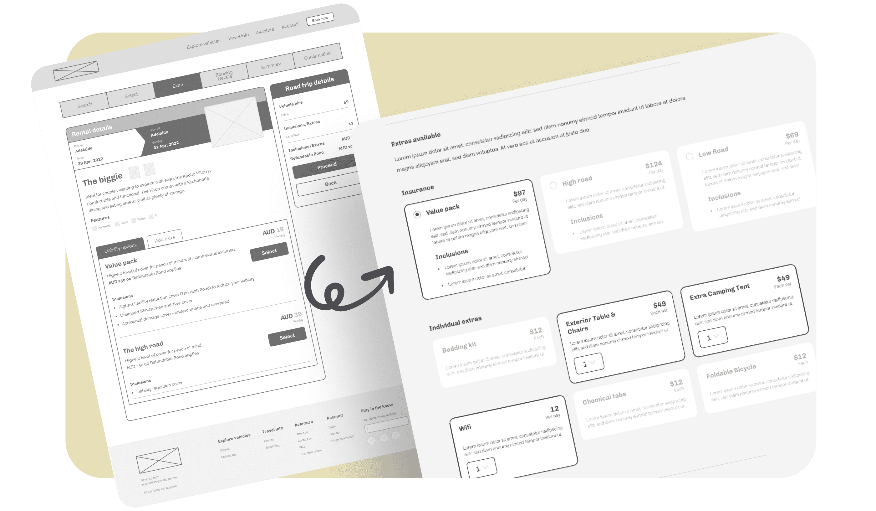
Refined Parts
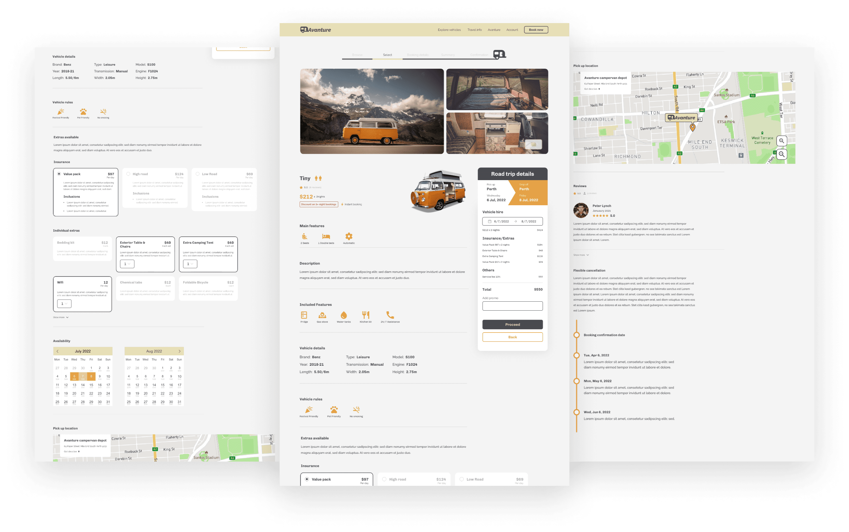
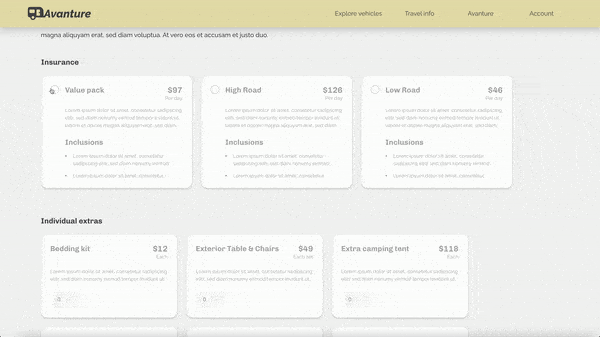
Based on usability study insights, I enhanced the checkout flow by using cards in the "add extra items" section. This change allows users to select and specify quantities for individual items, offering greater flexibility.
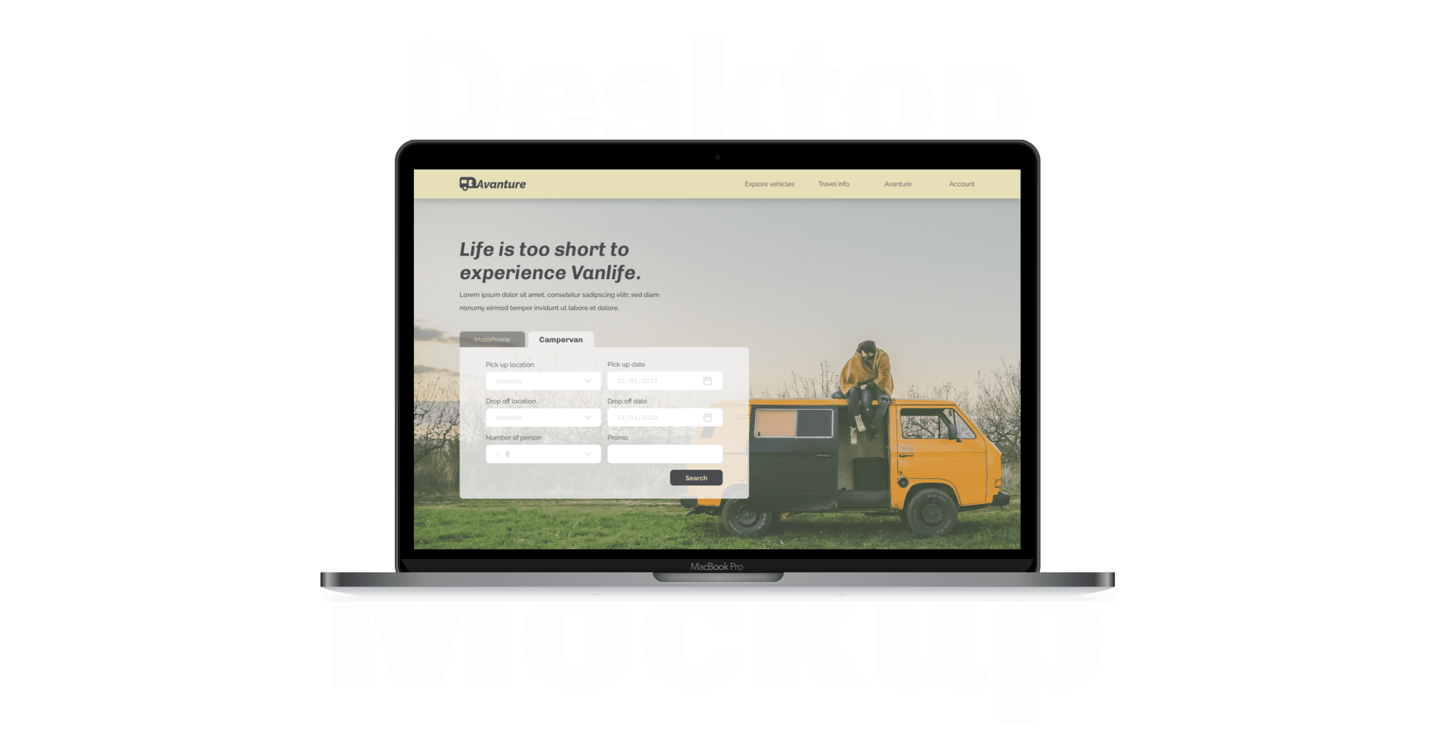
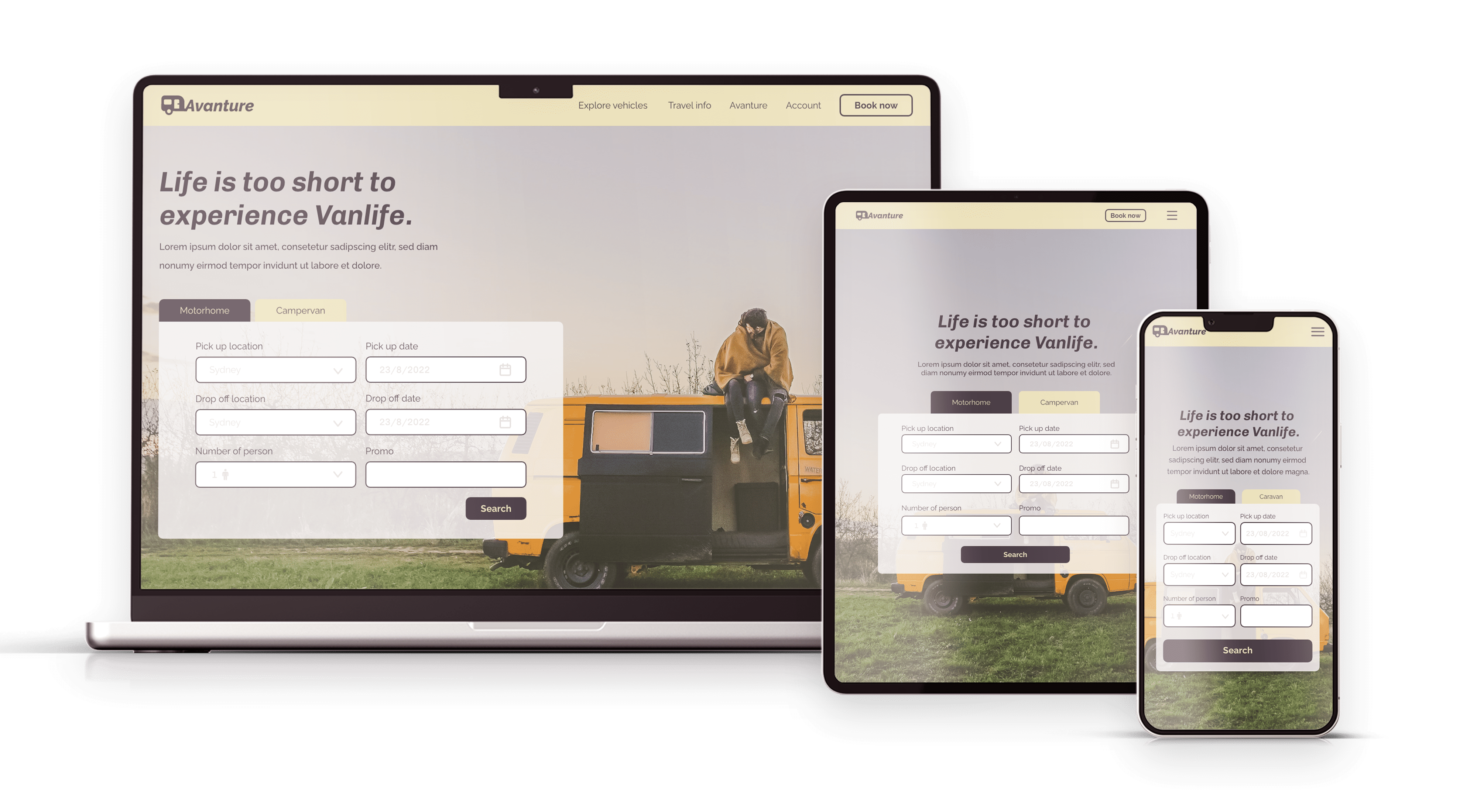
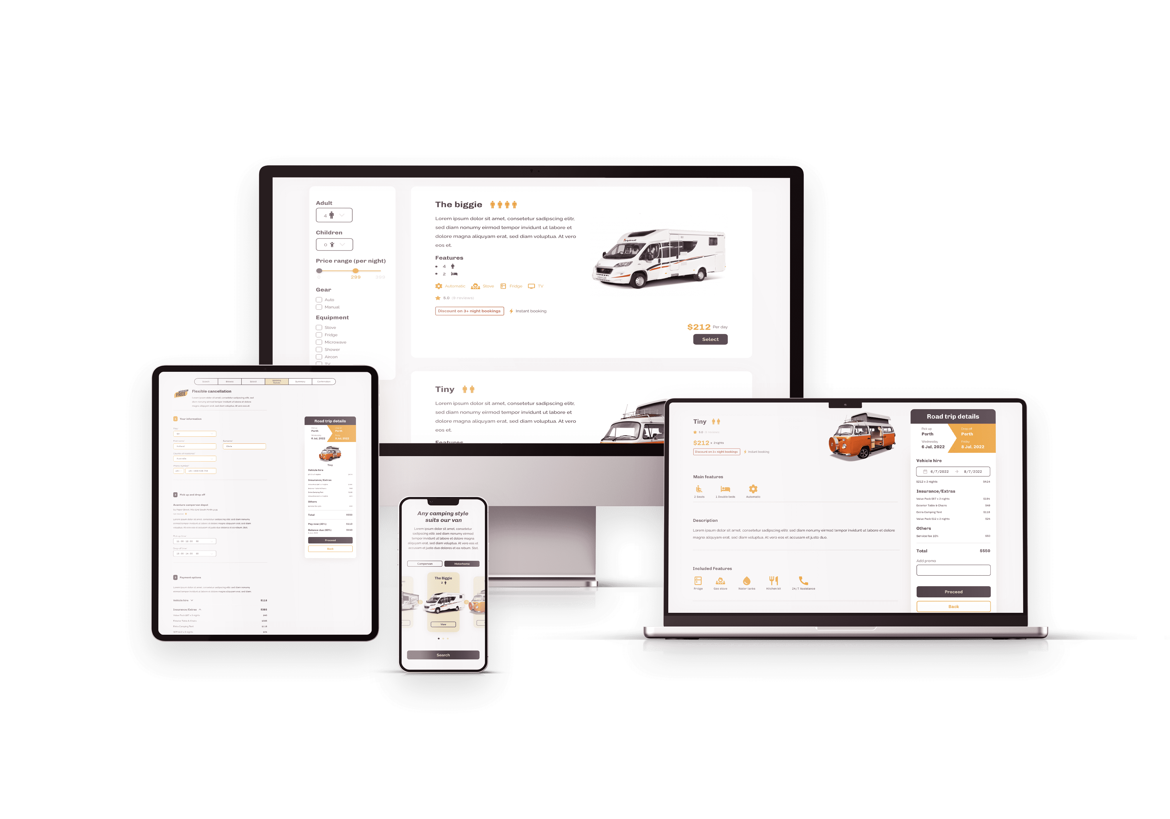
Responsive mockup
.png)
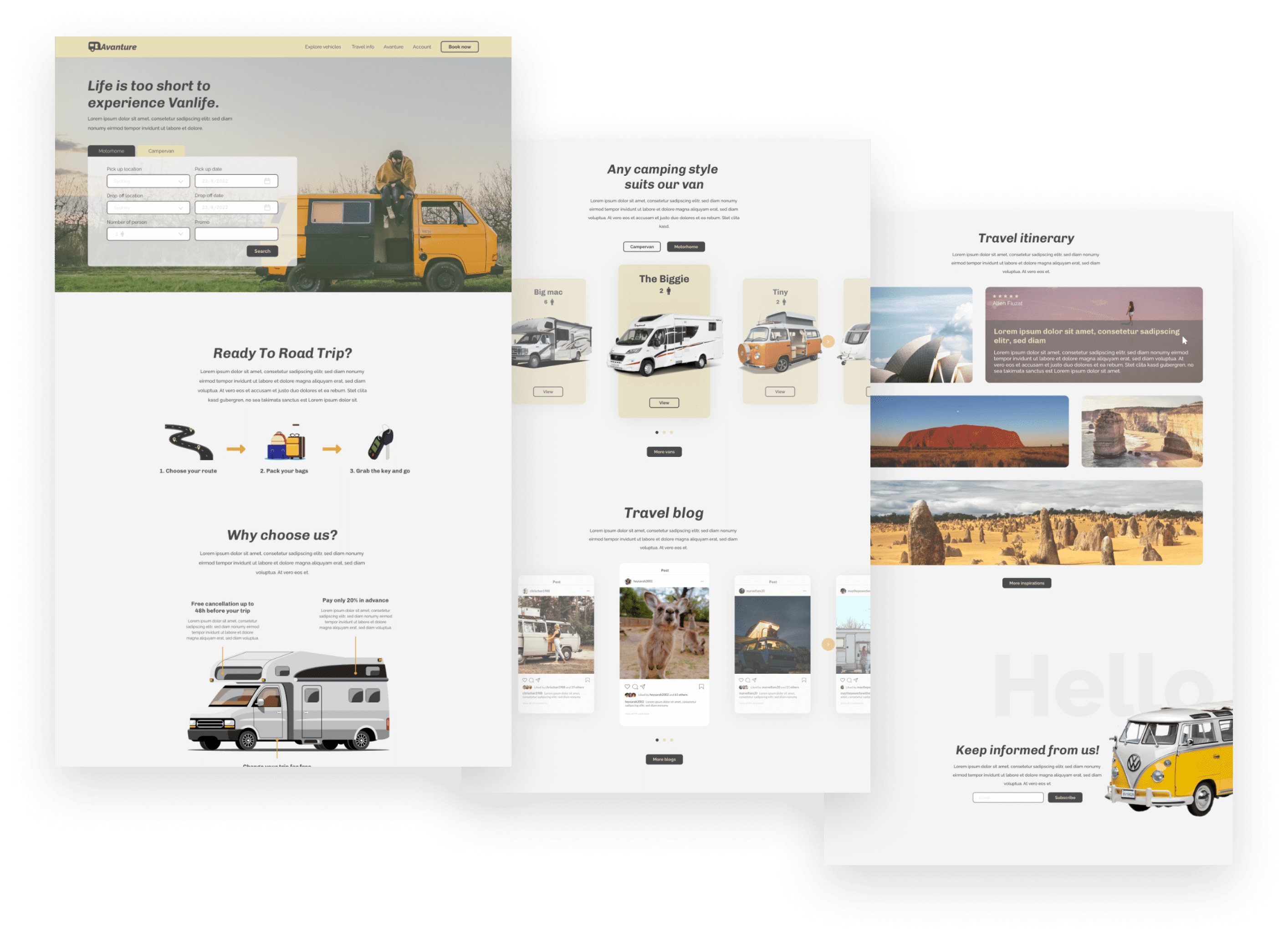
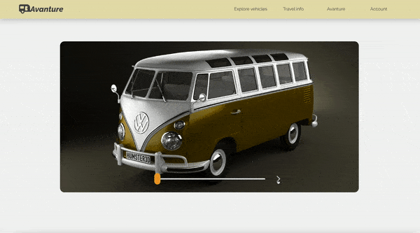
Takeaways
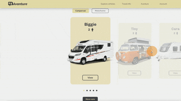
Our target users found the design engaging and easy to navigate, thanks to images and a 360-degree van showcase that provided clear visual hierarchy. This project taught me that small design changes can significantly impact user experience. The key takeaway is to always prioritize users' real needs when generating design ideas and solutions.